Contents
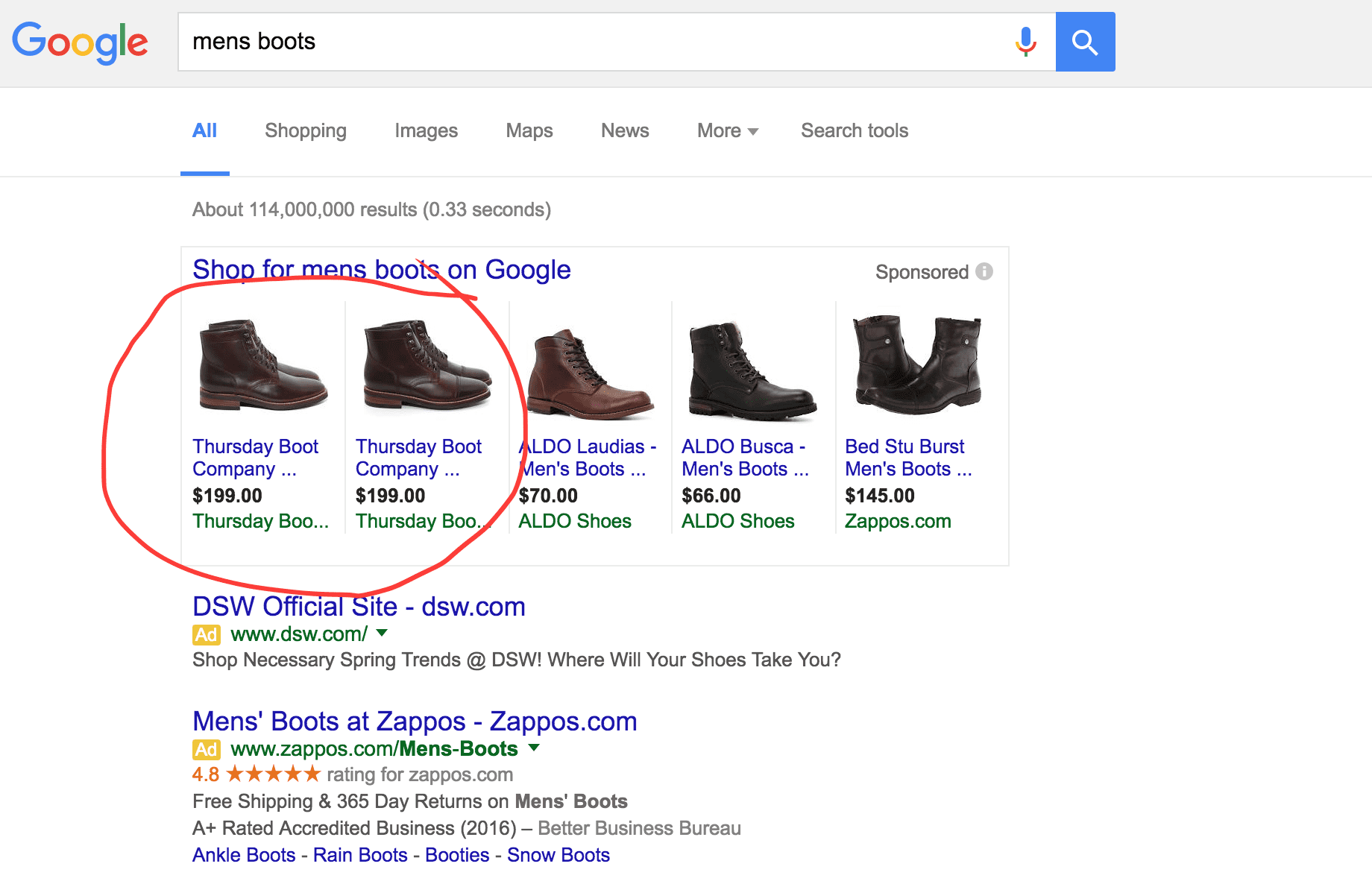
The adage “Content is King” is repeated over and over again in the SEO community, as well as among advertising agencies and web developers. Google wants to see that your site has great content too; convincing search engine crawlers that you have something worth reading or seeing is really the whole purpose of an SEO campaign. When it boils down to it, though, there are really only two ways to accomplish that: 1) tricking the search engine into thinking that your site has great content, or 2) actually having great content.
There are some ways to enhance the reach of your site’s content, but if you start with something sub-par, whatever inbound links you are able to create are going to come at a cost. That cost is generally going to be either your own time or the time of someone you’re paying to help generate inbound links to a mediocre message. Then when visitors DO arrive at your site, they end up underwhelmed by what they find.
We think that there is a better way. Our philosophy is to optimize a client’s site, not by artificial means, but by doing things that actually make the site more usable from a human perspective. Sure, we pay close attention to every technical detail. We experiment with and analyze a large dataset that we’ve acquired through tens of thousands of analyses done through our free website analysis tool, and we follow and contribute to the thought leadership within the SEO community, but the conclusion that we always end up arriving at is that to rank really well, the information on our client’s site needs to be excellent.
Visualizing data has been a great way to provide content that improves the quality of our clients’ sites. The process involved requires a considerable amount of work, both on the research side and on the production side, but the end product is something that truly adds value to a site. That value translates to increased natural inbound linking.
Identifying a Strong Infographic Candidate
Of course, not every client is a natural fit for data visualization. But you may ask yourself, “How do I make an infographic?” Most do not have access to proprietary industry data, which often comes at a considerable cost. Surprisingly, though, through brainstorming sessions and out-of-the-box thinking, data sources can be sought out and identified across a fairly wide variety of subjects. For our discussion, we will focus on two case studies–two actual examples of infographics we developed for our clients.
Infographic Construction: Drupal Module Expansion
To develop a data representation around Duo Consulting’s target audience, we had to dive into the world of Drupal. Now, we are quite comfortable finding our way around a Drupal install, and we provide consultation services for and implement changes to a variety of Drupal sites–but creating a successful infographic that highlighted some of the growth in the Drupal world proved to be a challenge. Determining how many sites rely on Drupal is nearly impossible, and comparing Drupal to, say, Wordpress or Joomla in terms of compatible data points likewise provided little in the way of reliable data.
We returned to the drawing board a number of times with this project, going back and forth with our client to find both a dataset that worked well with the direction of their company and one that would translate well into a graphical format.
In the end, we finalized the dataset with the number of Drupal modules developed through the past years, along with a comparison of which areas were most well-represented. That finished step one, but we had taken on more than we realized!
In creating a visualization of the Drupal data, we ran into some difficulty. Doing a breakdown by year of the number of modules, along with an overview of the general growth of the platform presented an issue with scalability of the design. When we worked to include the detail, the image became too large and unusable, when we attempted to provide more of an overview, the design lacked the depth we had hoped for.
In presenting to our client, we ran into the age-old problem of the graphic not making immediate sense to them; we had been looking at, digesting, and dissecting the data for too long, and what seemed intuitive to us was lost on new viewers–definitely a problem for any data visualization.
So it went back to the drawing board again, and with the help of a dedicated team, we revisited the entire design. The end result was simple, and illustrated exactly what we had intended to convey. The creation process required more hours than we had anticipated, but in the end we had created a design that helped people see the exponential growth of the Drupal community quickly and succinctly.
We learned a lot from this creation process: the importance of identifying the right topic to address; the “fudge-factor” we needed to account for in budgeting the time allotted to a project like this; and probably most importantly, how easy it is to be too close to the project at hand. Client input is an absolute must!
Coal Seam Gas Polling
Another data visualization project we undertook revolved around Coal Seam Gas. In this instance, the client had already compiled the data, and we recognized an opportunity to help them increase the likelihood of inbound links to their blog post by visually representing the data. This was a straight-forward project on our end, and we were able to deliver the final project with minimal revisions.
Even though our visualization was not incredibly complex in this instance, and the data was basically handed to us, the addition of a visualization of their data made their poll numbers come to life much more readily than the numbers by themselves.
The most important thing, though, is that in both cases we were able to either provide original content, or improve the existing content of a client’s site. With each client, we were able to secure several immediate inbound links from a variety of sites with high domain authority and potentially grab additional, natural links from the wild.
On top of that, at the end of the day both sites ended up with visually appealing, graphical representations of subjects related to their industries. They ended up with content that will appeal to their human visitors, not just to search engine crawlers.
Infographics are going to continue to be a part of SEO strategies we implement for a variety of our clients, and I think that it is a trend that will stick around for quite some time.
We will have more to say about infographic value, design, and implementation in future posts–it is an exciting product that we are very happy to be able to offer!